Measuring Utility and Information Loss
SDC is a trade-off between risk of disclosure and loss of data utility and seeks to minimize the latter, while reducing the risk of disclosure to an acceptable level. Data utility in this context means the usefulness of the anonymized data for statistical analyses by end users as well as the validity of these analyses when performed on the anonymized data. Disclosure risk and its measurement are defined in the Section Measure Risk of this guide. In order to make a trade-off between minimizing disclosure risk and maximizing utility of data for end users, it is necessary to measure the utility of the data after anonymization and compare it with the utility of the original data. This section describes measures that can be used to compare the data utility before and after anonymization, or alternatively quantify the information loss. Information loss is the inverse of data utility: the larger the data utility after anonymization, the smaller the information loss.
Note
If the microdata to be anonymized is based on a sample, the data will incur a sampling error. Also other errors may be present in the data, such as nonresponse error.
Note
The methods discussed here only measure the information loss caused by the anonymization process relative to the original sample data and do not attempt to measure the error caused by other sources.
Ideally, the information loss is evaluated with respect to the needs and uses of the end users of the microdata. However, different end users of anonymized data may have very diverse uses for the released data and it might not be possible to collect an exhaustive list of these uses. Even if many uses can be identified, the characteristics in the data needed for these uses can be contradictory (e.g., one user needs a detailed geographical level whereas another is interested in a detailed age structure and does not need a detailed geographical structure). Nevertheless, as pointed out earlier, only one anonymized dataset can be released for each dataset and every type of release to avoid unintended disclosure. Releasing multiple anonymized datasets for different purposes may lead to unintended disclosure. [1] Therefore, it is not possible to anonymize and release a file tailored to each user’s needs.
Since collecting and taking into account all data uses is often impossible, we also look at general (or generic) information loss measures besides user- and data-specific information loss measures. These measures do not take into account the specific data use, but can be used as guiding measures for information loss and evaluating whether a dataset is still analytically valid after anonymization. The main idea for such measures is to compare records between the original and treated datasets and compare statistics computed from both datasets (HDFG12). Examples of such measures are the number of suppressions, number of changed values, changes in contingency tables and changes in mean and covariance matrices.
Many of the SDC methods discussed earlier are parametric, in the sense that their outcome depends on parameters chosen by the user. Examples are the cluster size for microaggregation (see the Section Microaggregation) or the importance vector in local suppression (see the Section Local suppression). Data utility and information loss measures are useful for choosing these parameters by comparing the impact of different parameters on the information loss. Fig. 13 illustrates this by showing the trade-off between the disclosure risk and data utility of a hypothetical dataset. The triangle represents the original data with full utility and a certain level of disclosure risk, which is too high for disclosure. The square represents no release of microdata. Although there is no risk of disclosure, there is also no utility from the data for users since no data is released. The points in between represent the result of applying different SDC methods with different parameter specifications. We would select the SDC method corresponding to the point, which maximizes the utility, while keeping disclosure risk at an acceptable level.
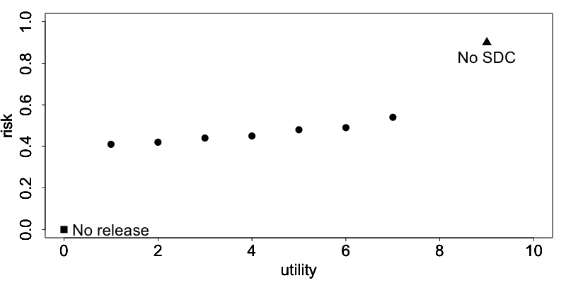
Fig. 13 The trade-off between risk and utility in a hypothetical dataset
In the following sections, we first propose general utility measures independent of data use, and later present an example of a specific measure useful to measure information loss with respect to specific data uses. Finally, we show how to visualize changes in the data caused by anonymization and discuss the selection of utility measures for a particular dataset.
General utility measures for continuous and categorical variables
General or generic measures of information loss can be divided into those comparing the actual values of the raw and anonymized data, and those comparing statistics from both datasets. All measures are a posteriori, since they measure utility after anonymization and require both the data before and after the anonymization process. General utility measures are different for categorical and continuous variables.
General utility measures for categorical variables
Number of missing values
An informative measure is to compare the number of missing values in the data. Missing values are often introduced after suppression and more suppressions indicate a higher degree of information loss. More generally, it is possible to count and compare the number of missing values in the original data and the treated data. This can be useful to see the proportional increase in the number of missing values. Missing values can also have other sources, such as nonresponse.
Number of records changed
Another useful statistic is the number of records changed per variable. The number of records changed gives a good indication of the impact of the anonymization methods on the data.
Comparing contingency tables
A useful way to measure information loss in categorical variables is to compare univariate tabulations and, more interestingly, contingency tables (also cross tabulations or two-way tables) between pairs of variables. To maintain the analytical validity of a dataset, the contingency tables should stay approximately the same.
DoTo01b propose a Contingency Table-Based Information Loss (CTBIL) measure, which quantifies the distance between the contingency tables in the original and treated data. Alternatively, visualizations of the contingency table with mosaic plots can be used to compare the impact of anonymization methods on the tabulations and contingency tables (see the Section Mosaic plots).
General utility measures for continuous variables
Statistics: mean, covariance, correlation
The statistics characterizing the dataset should not change after the anonymization. Examples of such statistics are the mean, variance, and covariance and correlation structure of the most important variables in the dataset. Other statistics characterizing the data include the principal components and the loadings. DoTo01b give an overview of statistics that can be considered. In order to evaluate the information loss caused by the anonymization, one should compare the appropriate statistics for continuous variables computed from the data before and after anonymization. There are several ways to evaluate the loss of utility with respect to the changes in these statistics, for instance, by comparing means and (co-)variances in the data or comparing the (multivariate) distributions of the data. Especially changes in the correlations gives valuable information on the validity of the data for regressions.
DoTo01b propose several measures for the discrepancy between the covariance and correlation matrices. These measures are based on the mean squared error, the mean absolute error or the mean variation of the individual cells. We refer to DoTo01b for a complete overview of these measures.
IL1s information loss measure
Alternatively, we can also compare the actual data and quantify the distance between the original dataset \(X\) and the treated dataset \(Z\). Here \(X\) and \(Z\) contain only continuous variables. YaWC02 introduce the distance measure IL1s, which is the sum of the absolute distances between the corresponding observations in the raw and anonymized datasets, which are standardized by the standard deviation of the variables in the original data. For the continuous variables in the dataset, the IL1s measure is defined as
where \(p\) is the number of continuous variables; \(n\) is the number of records in the dataset; \(x_{\text{ij}}\) and \(z_{\text{ij}}\), respectively, are the values before and after anonymization for variable \(j\) and individual \(i\); and \(S_{j}\) is the standard deviation of variable \(j\) in the original data (YaWC02).
The measure is useful for comparing different methods. The smaller the value of the measure, the closer the values are to the original values and the higher the utility.
Note
This measure is related to risk measures based on distance and intervals (see the Section Risk measures for continuous variables).
The greater the distance between the original and anonymized values, the lower the data utility. Greater distance, however, also reduces the risk of re-identification.
Eigenvalues
Another way to evaluate the information loss is to compare the robust eigenvalues of the data before and after anonymization. Again, the main use is to compare different methods. The greater the value, the greater the changes in the data and the information loss.
Utility measures based on the end user’s needs
Not all needs and uses of a certain dataset can be inventoried. Nevertheless, some types of data have similar uses or important characteristics, which can be evaluated before and after anonymization. Examples of such “benchmarking indicators” (TMKC14) are different for each dataset. Examples include poverty measures for income datasets and school attendance ratios. Often ideas for selecting such indicators come from the reports data users publish based on previously released microdata.
The approach is to compare the indicators calculated on the untreated data and the data after anonymization with different methods. If the differences between the indicators are not too large, the anonymized dataset can be released for use by researchers. It should be taken into account that indicators calculated on samples are estimates with a certain variance and confidence interval. Therefore, for sample data, it is more informative to compare the overlap of confidence intervals and/or to evaluate whether the point estimate calculated after anonymization is contained within the confidence interval of the original estimate. Examples of benchmark indicators and their confidence intervals are included in the case studies in these guidelines. Here we give the example of the GINI coefficient.
The GINI coefficient is a measure of statistical dispersion, which is often used to measure inequality in income. A way to measure the information loss in income data is to compare the income distribution, which can be easily done by comparing the GINI coefficients. The GINI coefficient of sample data is a random variable. Therefore, it is useful to construct a confidence interval around the coefficient to evaluate the significance of any change in the coefficient after anonymization.
Regression
Besides comparing covariance and correlation matrices, regressions are a useful tool to evaluate whether the structure in the data is maintained after anonymization. By comparing regressions parameters, it is also possible to compare relations between non-continuous variables (e.g., by introducing dummy variables or regression with ordinal variables). If it is known for what purpose and in what field the data is used, common regressions can be used to compare the change in coefficients and confidence intervals.
An example of using regression to evaluate the data utility in income data is the Mincer equation. The Mincer equation explains earnings as a function of education and experience while controlling for other variables. The Mincer equation is often used to evaluate the gender pay gap and gender wage inequality by including a gender dummy. Here we show how to evaluate the impact of anonymization methods on the gender coefficient. We regress the log income on a constant, a gender dummy, years of education, years of experience, years of experience squared and other factors influencing wage.
The parameter of interest here is \(\beta_{1}\), the effect of gender on the log wage. X is a matrix with several other factors influencing wage and \(\beta\) the coefficients of these factors.
If the new estimates fall within the original confidence interval and the new and original confidence intervals are greatly overlapping, the data can be considered valid for this type of regression after anonymization. Fig. 14 shows the point estimates and confidence intervals for the gender coefficient in this trade-off for a sample income dataset and several SDC methods and parameters. The red dot and confidence bar (on the top) correspond to the estimates for the untreated data, whereas the other confidence bars correspond to the respective SDC methods and different parameters. The anonymization reduces the number of expected re-identifications in the data (left axis) and the point estimates and confidence intervals vary greatly for the different SDC methods. We would choose a method, which reduces the expected number of identifications, while not changing the gender coefficient and having a great overlap of the confidence interval with the confidence interval estimated from the original data.
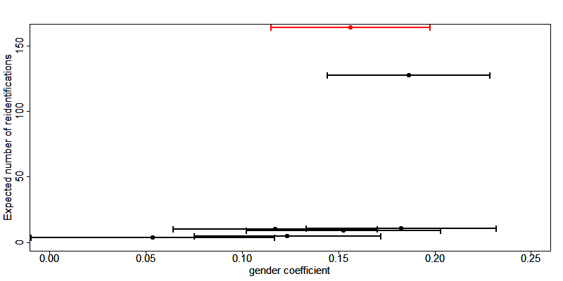
Fig. 14 Effect of anonymization on the point estimates and confidence interval of the gender coefficient in the Mincer equation
Assessing data utility with the help of data visualizations
The use of graphs and other visualization techniques is a good way to assess at a glance how much the data have changed after anonymization, and can aid the selection of appropriate anonymization techniques for the data. Visualizations can be a useful tool to assess the impact on data utility of anonymization methods and helps choose among anonymization methods. The software package R provides several functions and packages that can help visualize the results of anonymization. This section provides a few examples. We present the following visualizations:
- histograms and density plots
- boxplots
- mosaic plots
To make appropriate visualizations, we need to use the raw data and the anonymized data.
Histograms and density plots
Histograms and density plots are useful for quick comparisons of variable distribution before and after anonymization. The advantage of histograms is that the results are exact. Visualization depends on the bin widths and the start point of the first bin, however. Histograms can be used for continuous and semi-continuous variables. Density plots display the kernel density of the data; therefore, the plot depends on the kernel that is chosen and whether the data fits the kernel well. Nevertheless, density plots are a good tool to illustrate the change of values and value ranges of continuous variables.
Fig. 15 and Fig. 16 show examples. The histograms and density plots give a clear indication how the values have changed: the variability of the data has increased and the shape of the distribution has changed.
Note
The vertical axes of the histograms have different scales.
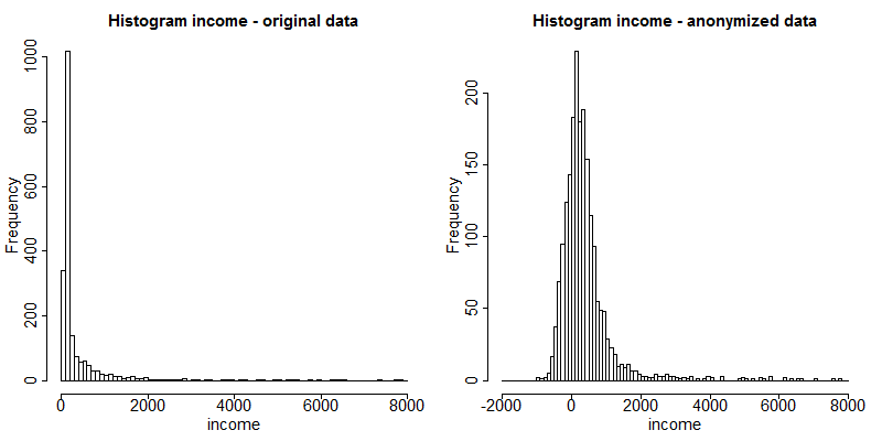
Fig. 15 Histograms of income before and after anonymization
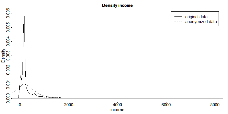
Fig. 16 Density plots of income before and after anonymization
Box plots
Box plots give a quick overview of the changes in the spread and outliers of continuous variables before and after anonymization. Fig. 17 shows an example for an expenditure variable after adding noise. The box plot shows clearly that the variability in the expenditure variable increased as a result of the anonymization methods applied.
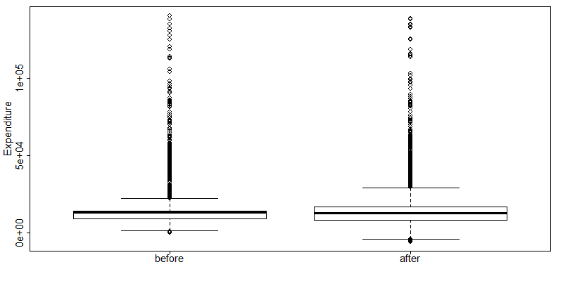
Fig. 17 Example of box plots of an expenditure variable before and after anonymization
Mosaic plots
Univariate and multivariate mosaic plots are useful for showing changes in the tabulations of categorical variables, especially when comparing several “scenarios” next to one another. A scenario here refers to the choice of anonymization methods and their parameters. With mosaic plots we can, for instance, quickly see the effect of different levels of \(k\)-anonymity or differences in the importance vectors in the local suppression algorithm (see the Section Local suppression).
We illustrate the changes in tabulations with an example of the variable “WATER” before and after applying PRAM. We can use mosaic plots to quickly see the changes for each category. Looking at the mosaic plot in Fig. 18 we see invariant PRAM has virtually no influence on the univariate distribution.
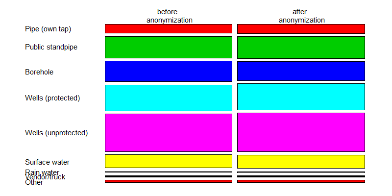
Fig. 18 Mosaic plot to illustrate the changes in the WATER variable
We use the variables “gender” and “relationship status” to illustrate the use of mosaic plots for the illustration of changes in univariate tabulations introduced by several sets of anonymization methods. Table 19 provides the methods applied in each scenario. Scenario 0, the base scenario, shows the original categories of the gender and relationship status variables, while scenarios 1 to 6 show shifts in the categories after applying different anonymization techniques. Table 6.1 provides a description of the anonymization methods used in each scenario. In total we visualize the impact of six different sets of anonymization methods. We can use mosaic plots to quickly see which set of methods has what impact on the gender and relationship status variables, which can be used to select the best scenario. Looking at the mosaic plots in Fig. 19 , we see that scenarios 2, 5 and 6 give the smallest changes for the gender variable and scenarios 3 and 4 for the relationship status variable.
| Scenario | Description of anonymization methods applied |
|---|---|
| 0 (base) | Original data, no treatment |
| 1 | Recode age (five-year intervals), plus local suppression (required k = 3, high importance on water, toilet and literacy variables) |
| 2 | Recode age (five-year intervals), plus local suppression (required k = 5, no importance vector) |
| 3 | Recode age (five-year intervals), plus local suppression (required k = 3, high importance on toilet), while also recoding region, urban, education level and occupation variables |
| 4 | Recode age (five-year steps), plus local suppression (required k = 5, high importance on water, toilet and literacy), while also recoding region, urban, education level and occupation variables |
| 5 | Recode age (five-year intervals), plus local suppression (required k = 3, no importance vector), microaggregation (wealth index), while also recoding region, urban, education level and occupation variables |
| 6 | Recode age (five-year intervals) plus local suppression (required k=3, no importance vector), PRAM literacy, while also recoding region, urban, education level and occupation variables |
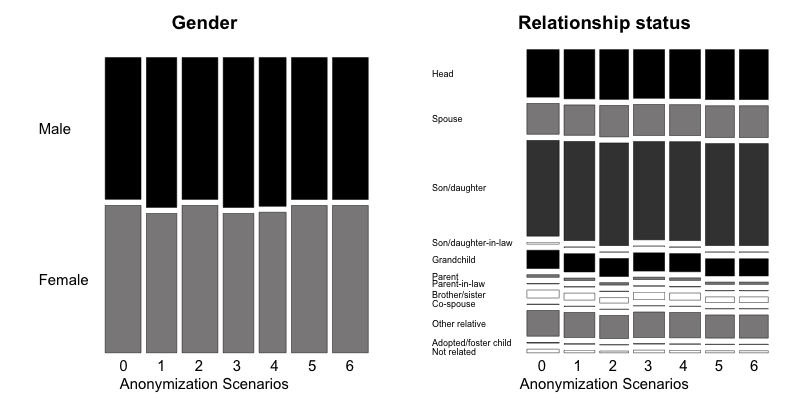
Fig. 19 Comparison of treated vs. untreated gender and relationship status variables with mosaic plots
As we discussed in the Section PRAM (Post RAndomization Method) , invariant PRAM preserves the univariate distributions. Therefore, in this case it is more interesting to look at the multivariate mosaic plots. Mosaic plots are also a powerful tool to show changes in cross-tabulations/contingency tables. To compare the changes, we need to compare two different plots. Fig. 20 and Fig. 21 illustrate that (invariant) PRAM does not preserve the two-way tables in this case.
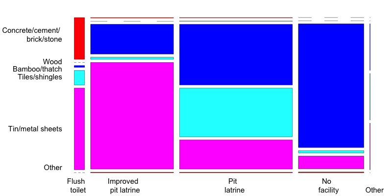
Fig. 20 Mosaic plot of the variables ROOF and TOILET before anonymization
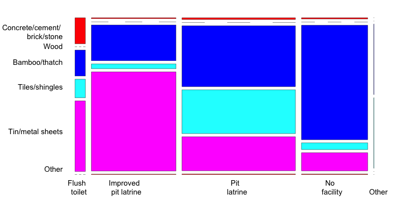
Fig. 21 Mosaic plot of the variables ROOF and TOILET after anonymization
Choice of utility measure
Besides the users’ requirements on the data, the utility measures should be chosen in accordance with the variable types and anonymization methods employed. The employed utility measures can be a combination of both general and user-specific measures. As discussed earlier, different utility measures should be used for continuous and categorical data. Furthermore, some utility measures are not informative after certain anonymization methods have been applied. For example, after applying perturbative methods that interchange data values, comparing values directly is not useful because they will give the impression of high levels of information loss. In such cases, it is more informative to look at means, covariances and benchmarking indicators that can be computed from the data. Furthermore, it is important not only to focus on the characteristics of variables one by one, but also on the interactions between variables. This can be done by cross-tabulations and regressions. In general, when anonymizing sampled data, it is advisable to compute confidence intervals around estimates to interpret the magnitude of changes.
Recommended Reading Material on Measuring Utility and Information Loss
A.G. De Waal and L.C.R.J. Willenborg. 1999. “Information Loss through Global Recoding and Local Suppression” In Netherlands Official Statistics: Special Issue on SDC, 14, 17-10.
J. Domingo-Ferrer, J.M. Mateo-Sanz and V. Torra. 2001. “Comparing SDC Methods for Microdata on the basis of Information Loss and Disclosure Risk”. In Pre-proceedings of ETK-NTTS 2001 (vol. 2), 807-826. http://neon.vb.cbs.nl/casc/NTTSJosep.pdf
J. Domingo-Ferrer and V. Torra. 2001. “Disclosure Protection Methods and Information Loss for Microdata”. In P. Doyle, J.I. Lane, J.J.M. Theeuwes and L. Zayatz (eds.) Theory and Practical Applications for Statistical Agencies, 91-110, Amsterdam. http://crises-deim.urv.cat/webCrises/publications/bcpi/cliatpasa01Disclosure.pdf
| [1] | It is possible to release data files for different groups of users, e.g., PUF and SUF. All information in the less detailed file, however, must also be included in the more detailed file to prevent unintended disclosure. Datasets released in data enclaves can be customized for the user, since the risk that they will be combined with other version is zero. |
References
| [DoTo01b] | Domingo-Ferrer, J., & Torra, V. (2001). Disclosure Protection Methods and Information Loss for Microdata. In P. Doyle, J. Lane, J. Theeuwes, & Z. L., Theory and Practical Applications for Statistical Agencies (pp. 91-110). Amsterdam. |
| [HDFG12] | Hundepool, A., Domingo-Ferrer, J., Franconi, L., Giessing, S., Nordholt, E. S., Spicer, K., et al. (2012). Statistical Disclosure Control. Chichester, UK: John Wiley & Sons Ltd. |
| [TMKC14] | Templ, M., Meindl, B., Kowarik, A., & Chen, S. (2014, August 1). Introduction to Statistical Disclosure Control (SDC). Retrieved July 9, 2018, from http://www.ihsn.org/home/software/disclosure-control-toolbox. |
| [YaWC02] | Yancey, W. W., Winkler, W. E., & Creecy, R. H. (2002). Disclosure Risk Assessment in Perturbative Microdata Protection. Research Report Series , Statistics 2002-01. |